Ahead App Case Study: $23 Revenue Per Download With Smart Onboarding & Paywall Design (2025)
How Ahead generates $23 revenue per app download using psychology-driven onboarding. Complete breakdown of tactics you can copy today.
Kevser
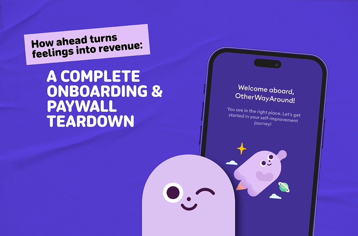
How a friendly quiz, a tiny drawing ritual, and sharp pricing psychology convert mental health app users at scale
Mental health apps face a unique challenge: users arrive vulnerable, skeptical, and often resistant to paying upfront for something that might not work. Most fail not because of bad UI, but because of emotional friction.
Ahead has cracked this code. With 79k downloads generating $1.8M in Q3 alone (that's roughly $23 revenue per download), they've built a funnel that transforms hesitant visitors into paying customers through humor, micro-commitments, and a paywall that feels inevitable rather than intrusive.
Here's exactly how they do it—and how you can adapt their playbook for your own app.
The Numbers That Matter
Q3 2024 US Performance (via Mobile Action):
- 79k downloads
- $1.8M revenue
- ~$22.80 revenue per download
H1 2025 Performance (via Mobile Action):
- $2.7M revenue (US)
- $3.26M worldwide
These aren't just impressive numbers—they signal a funnel that monetizes hard. Let's break down the specific mechanisms driving this performance.
The Complete Funnel: From Click to Charge
Ahead's conversion path follows a carefully orchestrated sequence:
- Entry Point → Ad or cross-promotion
- Emotional Quiz → 6-10 micro questions targeting feelings (not diagnoses)
- Commitment Ritual → Draw a check to commit
- Plan Reveal → "Your plan is ready" timeline
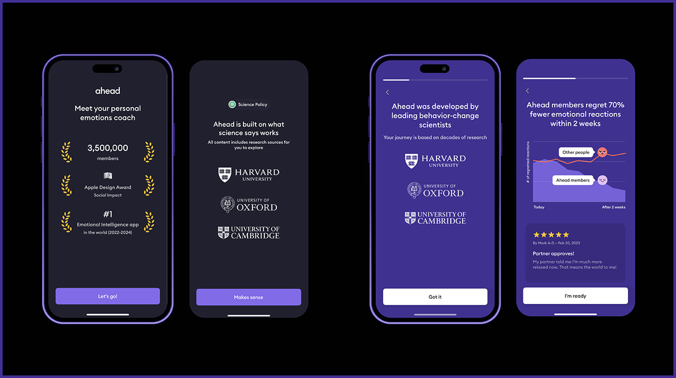
- Trust Building → Social proof and privacy cues
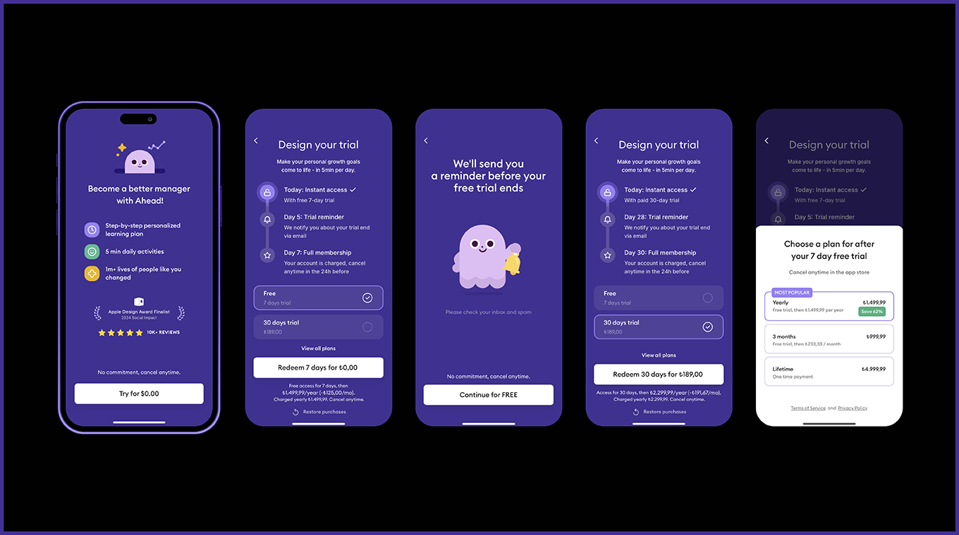
- Paywall → Outcome headline, annual anchor, 30-day paid trial
- Purchase → Native iOS purchase sheet
- Activation → Day 1 content mirroring quiz language
- Retention → Day 7 nudge closing the loop
Critical insight: Intent peaks at the plan reveal, risk spikes at the paywall, and social proof near the CTA saves sessions.
The Psychology Behind the UI
Humor That Scales Decisions
Instead of clinical rating scales, Ahead uses playful descriptors like "cold as a cucumber" to "hot like jalapeño." This isn't just cute. It's strategic.
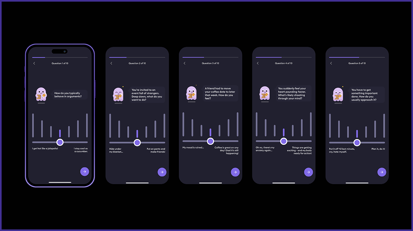
Why it works:
- Reduces anxiety around self-assessment
- Speeds decision-making
- Makes long flows feel shorter
Implementation tips:
- Use humor only on the first 2-3 questions
- Keep remaining questions crisp and empathetic
- Localize idioms that don't translate
Micro-Commitments Through Drawing
The genius move: users draw a check mark to start, then draw a smile to finish. This transforms a passive quiz into an active commitment.

The psychology: When people physically interact with your interface (beyond just tapping), they experience the "IKEA effect"—increased attachment to things they helped create.
Advanced tactics:
- Save the drawing and display it in the plan header
- Reference it in push notifications: "Remember that check you drew?"
- Turn it into a micro-contract: "I will spend 5 minutes daily this week"
Personalization That Feels Real
Ahead's "plan ready" sequence appears bespoke even when mostly templated. The secret is personalizing where it matters most: week one.

Theater you can maintain:
- Name plans using quiz language
- Show timelines with 3-5 specific steps
- Mirror user language in headlines and notifications
Real personalization worth the effort:
- Reorder day 1 tasks by their top stated problem
- Adjust session length based on available time
- Delay notifications for users reporting overwhelm
Trust, Safety, and the Guardian Play
Strategic Trust Building
Social proof appears precisely where users need confidence: near the CTA. Privacy and "safe space" messaging is simple and prominent.
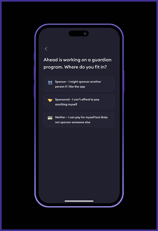
The Guardian Sponsorship Innovation
Here's where Ahead gets creative: a special flow for younger users to get sponsored by parents or caregivers.
The flow:
- Teen requests sponsorship
- Guardian receives purchase link
- Guardian completes purchase
- Teen account auto-provisions
- Weekly digest keeps guardian engaged
Business impact: Unlocks a demographic with high engagement but low purchasing power while adding a supportive stakeholder invested in success.
Paywall Anatomy: Every Element Earns Its Place
Message Hierarchy
- Headline: Repeats the user's goal in their exact words
- Benefits: Three outcome bullets (not feature lists)
- Social proof: Positioned near the button
- Single CTA: One dominant action
Choice Architecture
The annual plan dominates visually while monthly exists as an "escape hatch." This isn't accidental—it's deliberate decoy effect in action.
The 30-Day Paid Trial Strategy
Instead of a free trial, Ahead uses a small upfront payment ($2.99-$9.99) for extended access. This works because:
- Users who pay anything show higher intent
- Longer runway allows value to compound
- Reduces refund gaming
When to use: If your "aha moment" takes longer than 3 days or your program requires sustained engagement.
Lifecycle Tactics That Make Paywalls Honest
Taste Before Purchase
Users complete a 45-60 second exercise tied to their quiz responses before seeing any paywall. This builds confidence and increases purchase intent.
Days 0-7: Mirror Their Language
Every touchpoint—push notifications, emails, in-app messages—echoes the exact words users chose during onboarding.
Recovery Sequences
If users abandon the purchase sheet, they return to a lighter ask: a starter plan or smaller trial, not the same paywall.
Mobile App A/B Testing Ideas: 13 Experiments to Increase Revenue Per Download
Here are the highest-impact experiments you can run, ranked by effort and risk:
Low Effort, Low Risk
- Humor vs. neutral tone on first 2 questions
- Outcome headline variants using user's top problem
- Objection bullets under CTA vs. in footer
- Weekly price equivalent shown on annual only
Medium Effort, Medium Risk
- Draw ritual timing: before vs. after paywall
- Dynamic social proof tied to user goals
- Paid trial price points: $2.99 vs. $4.99 vs. $9.99
- Channel-specific offers: annual-first for search, trial-first for social
- Taste-before-paywall: 45-60 second personalized exercise, then unlock full plan
- Offer ladder on exit: Show "Starter" plan or email course if paywall dismissed
- Recovery loop: Shorter, focused paywall on return with 1 benefit matching top goal
- Push opt-in timing: Ask for notifications after plan reveal, not during quiz
- Mascot micro-interactions: Subtle animations at decision points (for character-driven brands)
Measurement Framework
North Star Metric: 30-day net revenue per new install
Key Events: quiz_start, quiz_complete, ritual_complete, plan_view, paywall_view, purchase_sheet_open, purchase_success, day7_retained
Critical Guardrails: Refund rate, chargeback rate, support tickets mentioning billing confusion
How to Implement App Onboarding Psychology: Step-by-Step Blueprints
For Enterprise Teams
Roles needed: PM, UX writer, designer, analyst, CRM specialist, legal Cadence: Ship weekly, review monetization bi-weekly Tools: Remote-config paywalls, A/B testing platform, lifecycle messaging
For Indie Developers
Week 1 scope:
- 4-question quiz
- 1 drawing ritual
- 1 paywall template (RevenueCat/Glassfy)
- 2 lifecycle nudges
Essential tools: RevenueCat, PostHog, Customer.io/OneSignal Focus metric: 7-day paid conversion rate and refund rate
For Mobile Marketing Teams
Channel-specific strategy:
- ASA + CPP pairing: Build one creative per problem cluster (anxiety, burnout, sleep), mirror CPP headline in first onboarding screen
- Creative system: Hook shows mascot guiding micro-exercise, CTA promises "Your 1-week plan is ready"
- Offer testing by channel: Annual-first for Apple Search Ads (high intent), trial-first for paid social (curiosity > intent)
- Post-click analytics: Track which quiz path each channel over-indexes on, reinvest in highest LTV path (not lowest CPI)
App Onboarding Best Practices: What to Copy vs. Customize for Your Brand
Steal These Tactics
- Single intent per screen
- Outcome-focused headlines
- Social proof at decision points
- Drawing rituals for commitment
- Annual plan visual anchoring
Adapt to Your Brand
- Dark palette and mascot (depends on your aesthetic)
- Humor intensity (test what fits your voice)
- 30-day paid trial (consider your value delivery timeline)
Avoid These Pitfalls
- Early login requirements
- Generic "Subscribe" copy
- Wall-of-text benefit lists
- Hidden renewal information
Quick Audit: Is Your Funnel Ready?
Before implementing Ahead's tactics, run this diagnostic on your current flow:
- Can users reach a "you've started" moment in under 60 seconds?
- Does your paywall headline repeat the user's goal in their words?
- Is there a visible end to your onboarding flow?
- If users dismiss the paywall, do you recover with a smaller ask?
- Do your push notifications mirror the language users chose during signup?
Missing any of these? Start there before optimizing conversion copy.
Frequently Asked Questions
*Q: What's a good revenue per download for mobile apps?
A: While industry averages vary by category, Ahead's $22.80 per download significantly exceeds typical benchmarks. Most subscription apps see $2-8 per download, making Ahead's performance exceptional.
*Q: How long should app onboarding take?
A: Ahead's 60-second "you've started" moment shows that users need quick wins. Research indicates users abandon apps within 3-5 minutes if they don't see immediate value.
*Q: Should apps use free trials or paid trials?
A: Ahead's 30-day paid trial ($2.99-$9.99) works because users who pay anything show higher intent. Free trials often attract low-quality users who never convert.
*Q: What makes drawing rituals effective in apps?
A: Drawing creates physical commitment through the "IKEA effect" - people value things they help create. Ahead's check-drawing ritual transforms passive users into active participants.
*Q: How do you optimize app paywall conversion?
A: Focus on three elements: outcome-focused headlines using the user's exact words, annual plan visual anchoring, and social proof positioned near the call-to-action button.
The Bottom Line
Ahead succeeds because they understand that mental health customers need emotional scaffolding, not just features. Their funnel reduces anxiety at every step while building commitment through micro-interactions.
The real lesson isn't to copy their exact flow—it's to understand your users' emotional journey and design friction out of the path to value.
Whether you're building a meditation app, fitness platform, or productivity tool, the principles remain: make choices feel safe, let users commit gradually, and ensure your paywall feels like the natural next step in their journey.
Want help implementing these strategies in your app? The tactics above represent hundreds of hours of optimization work—but the right frameworks can compress that timeline significantly.